In this post I’m going to try out the recently published winfapReader R package for getting UK river flow data, and think about what I have learnt since my involvement in the project three years ago.
1 Intro
10 days ago, I received a notification for this tweet:
Four years after the first script my first attempt to a public R package is ready to be tested by others: https://t.co/kPR2cSDysQ is an interface with the @UK_NRFA extreme data locally or via their API. With thanks for the support/code to @clavitolo @mattfry_ceh @lukefshaw
— Ilaria Prosdocimi (@ilapros) April 8, 2020
Dr Ilaria Prosdocimi was my final year project (i.e. dissertation) supervisor at the University of Bath, and I last worked on river flow data about two and a half years ago. The package update was a very pleasant surprise and I am very grateful for being included as a contributor, as well as happy that code I wrote has been useful to somebody else!
2 Project reflections
The full pdf of my final report is available here.
Here are some quick thoughts after re-reading that document for the first time since submission:
2.1 Dates dates dates
I discovered then, and still love now, the lubridate package for anything involving dates.
2.2 Data cleaning
The following sentence rings true for every data project I have worked on since I wrote it three years ago:
I spent at least half of this project cleaning the data
For this project, the data cleaning/validation work even worked its way into the title - “Assessing the reliability of high flows records”.
2.3 More dates
- I’m reminded of the following lyric from the musical RENT:
How do you measure, measure a year
In my current job, the year can start in three different places:
- Academic year - Sep - Aug
- Financial year - Apr - Mar
- Calendar year - Jan - Dec
Re-reading my project made me laugh, as I had forgotten about the ‘Water Year’, which is Oct - Sep. In fact things get even more complicated as the years don’t all change at midnight on the 01st of the month, as the calendar year does. As mentioned above; thank heavens for lubridate!
2.4 Uncertainty over ‘old’ code
This is the first time that code I have written is truly public (other than a package which is so specific as to only be of use to one person in the world - whoever is in the job role I was in when I made it). It is somewhat daunting to think code I have written may be used by someone else.
Looking back now at the code I think how I would do things differently, but realistically I’m not going to go back and re-write things, as that task will always fall towards the bottom of the pile, and the code works, after all. It is a terrible temptation to never put code online for fear it could be better, as it always could be better.
3 Trying winfapReader
Here is a testcase of winfapReader looking at water gauging stations around Bristol, where I am currently based. I was inspired by this blog by Sean Turner.
3.1 Set-up and location
library(winfapReader) # new package to be trialled
library(rnrfa) # NRFA official package
library(tidyverse) # for data wrangling
library(knitr) # for table output formatting
The rnrfa package is on CRAN and useful for finding which gauge stations exist. The NRFA also has a search tool where you can manually find stations.
We’ll take the coordinates for the middle of Bristol, and define a bounding box for an area nearby:
bbw <- 0.4 #bounding box width
brist_latlong <- c(51.4545, -2.5879)
#get Bristol station data
riv_brist <- rnrfa::catalogue(bbox = list(lat_min = brist_latlong[1]-bbw/2,
                                        lat_max = brist_latlong[1]+bbw/2,
                                        lon_min = brist_latlong[2]-bbw/2,
                                        lon_max = brist_latlong[2]+bbw/2))

#only keep stations with highest quality data. An important step, and as my
#final year project can attest there's lots to think about with data quality!
riv_brist <- riv_brist %>% filter(`feh-pooling` == TRUE)

knitr::kable(riv_brist %>% select(id, name))| id | name |
|---|---|
| 53004 | Chew at Compton Dando |
| 53006 | Frome (Bristol) at Frenchay |
| 53017 | Boyd at Bitton |
| 53026 | Frome (Bristol) at Frampton Cotterell |
The rnrfa::catalogue function also returns a wealth of data which I won’t look at here, but just to say there are 101 columns-worth of info per site!
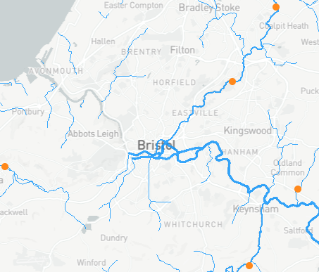
There are five stations are in the area, and one (id 52015 which is on the left of the image below) is deemed of not good enough quality to use here . So we’re left with four stations, shown in the image. The image is a screen grab from the NRFA search tool.
3.2 Getting POT data
The winfapReader package gives access to two sets of data:
- Annual Maxima
- Peaks Over the Threshold (POT)
My project was around the second, so that’s the data I’ll download and look at here. In a sentence:
POT data are the values recorded anytime the river flow exceeds the threshold, set by the NRFA to give an average of between 3 and 5 peaks a year.
Of course there is more information on the NRFA website, and in the project text, if you want to research further. It is interesting data.
With the winfapReader package, you can connect to NRFA’s API and download the data you want from just inputting the station ID. It outputs the data in a list of three tables, so I’ve made this little wrapper function to pull into a tibble:
reshape_pot_list_to_tbl_df <- function(id){
  ## takes the station id, gets POT data, and reshapes into tbl_df

  # use winfapReader package to get list
  pot_list <- winfapReader::get_pot(id)

  # join two table outputs
  pot_df <- pot_list$tablePOT %>%
    dplyr::left_join(pot_list$WaterYearInfo,by = 'WaterYear') %>%
    tibble::as_tibble()

  # add in start and end dates but as NA vals for all other cols
  # maybe not worth it? Only included so all get_pot info kept
  start_end_df <- tibble::tibble(Station = id,
                                 Date = pot_list$dateRange)
  pot_df <- pot_df %>%
    dplyr::bind_rows(start_end_df) %>%
    dplyr::arrange(Date)

  return(pot_df)
}
Now we can download POT data in one line (though of course number of lines of code is not a great metric for code quality!):
# all the heavy lifting happens in this line
brist_pot_df <- purrr::map_dfr(riv_brist$id, reshape_pot_list_to_tbl_df)
# add the name of the station for plotting later
brist_pot_df <- left_join(brist_pot_df,
                          riv_brist %>% select(id, name),
                          by = c("Station"="id"))

# lets see what the data looks like
str(brist_pot_df)
## tibble [605 x 8] (S3: tbl_df/tbl/data.frame)
## $ Station : num [1:605] 53004 53004 53004 53004 53004 ...
## $ Date : Date[1:605], format: "1992-11-29" "1992-11-30" ...
## $ WaterYear : num [1:605] NA 1992 1992 1992 1993 ...
## $ Flow : num [1:605] NA 30.1 16.8 21 22.3 17.4 16.5 22.3 20.2 15.4 ...
## $ Stage : num [1:605] NA 3.87 2.81 3.26 3.39 ...
## $ potPercComplete: num [1:605] NA 83.6 83.6 83.6 100 ...
## $ potThreshold : num [1:605] NA 14.7 14.7 14.7 14.7 ...
## $ name : chr [1:605] "Chew at Compton Dando" "Chew at Compton Dando" "Chew at Compton Dando" "Chew at Compton Dando" ...3.3 First plot
Here’s an initial plot of the data we’ve got;
#only take records above 75% completeness (also removes start/end dates)
plot_df <- brist_pot_df %>% filter(potPercComplete > 75)

#plots away!
ggplot(plot_df, aes(x=Date, y = Flow)) +
  geom_point() +
  facet_wrap(~name, scales = "free_y", ncol = 1) +
  labs(y = "Flow m/s",
       title = "POT all events by site")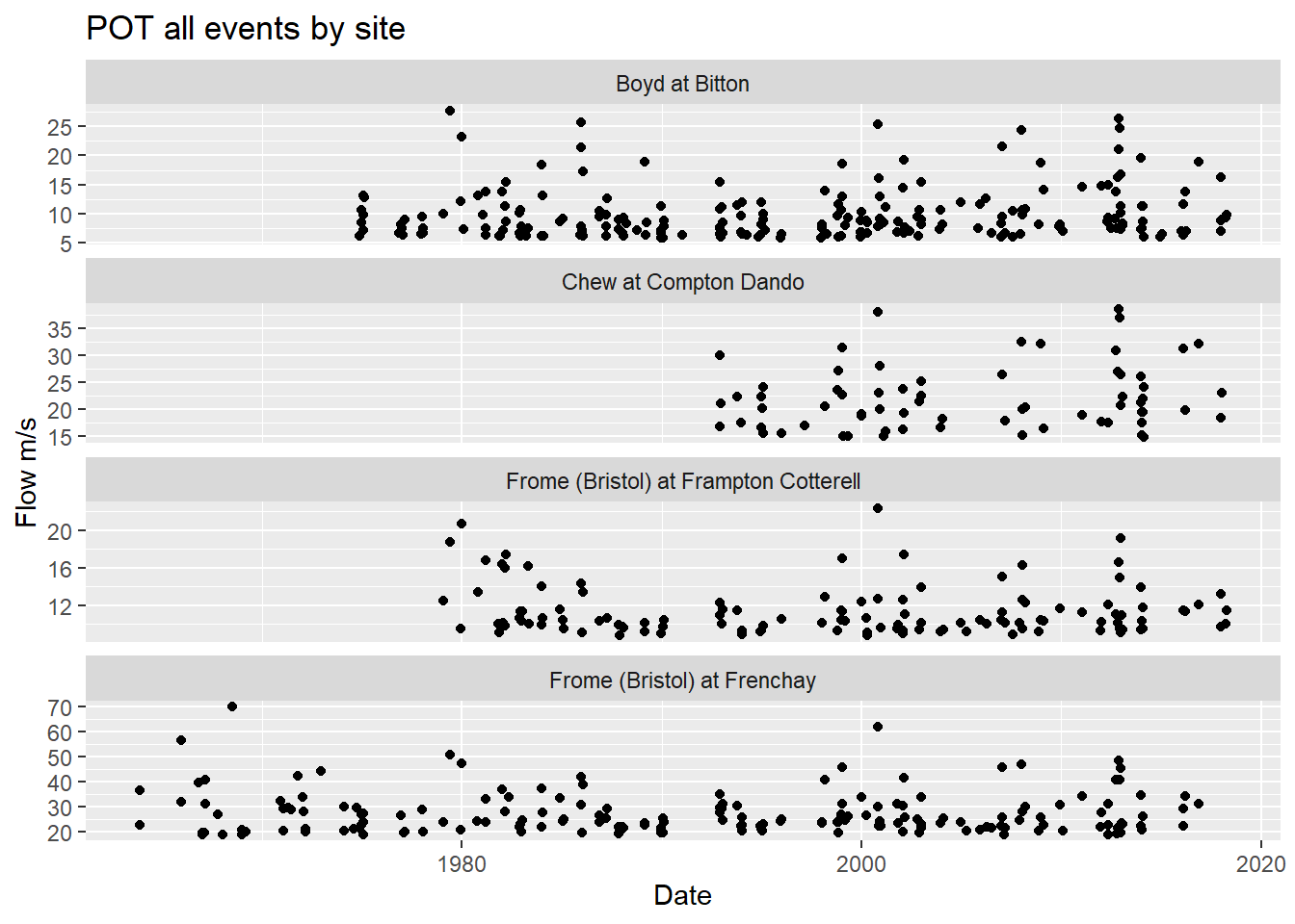
A few things spring to mind when looking at this plot:
The time period is different for different stations. Frome at Frenchay goes all the way back to the 1960s, whereas Chew at Compton Dando doesn’t start till the 1990s.
What happened around 2013? Seem to be lots of peaks?
The flow is different at different locations. The river Frome at Frenchay has a greater flow than it does at Frampton Cotterell, and a quick online search shows the Bradley Brook joins the River Frome between the two stations, so an increased flow makes sense. Always good to check the data, and keep the context in mind.
So the initial plotting has given rise to a few interesting questions to be explored further.
3.4 Consistent time period
To compare across stations, I’ll restrict the time period to when all four have data:
valid_dates_df <- brist_pot_df %>%
  # the NA potThreshold columns is a proxy for start and end date as
  # reshape_pot_list_to_tbl_df joined the list outputs from winfapReader::get_pot()
  filter(is.na(potThreshold)) %>%
  select(Station, Date) %>%
  group_by(Station) %>%
  summarise(start = min(Date), end = max(Date)) %>%
  ungroup() %>% pivot_longer(cols = c("start","end")) %>%
  # use the in-built Water Year finder function
  mutate(wy = winfapReader::water_year(value))
## `summarise()` ungrouping output (override with `.groups` argument)#start and end dates for where all stations have data
start_wy = max(valid_dates_df$wy[valid_dates_df$name == "start"])
end_wy = min(valid_dates_df$wy[valid_dates_df$name == "end"])
#make a cut version of the data set
brist_pot_filt_df <- brist_pot_df %>%
filter(WaterYear >= start_wy, WaterYear <= end_wy)Re-do our plot to check:
ggplot(brist_pot_filt_df %>% filter(!is.na(Date)), aes(x=Date, y = Flow)) +
  geom_point() +
  facet_wrap(~name, scales = "free_y", ncol = 1) +
  labs(y = "Flow m/s",
       title = "POT events by site for when all have data")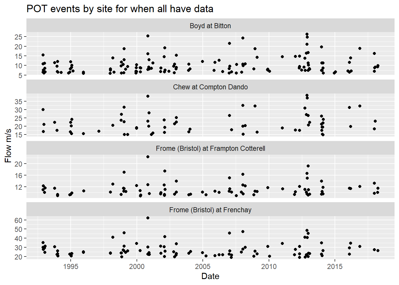
Looks good!
3.5 When were the most POTs?
If we wanted to know when the highest flow occurred each year, the POT data should not be the first port of call. The Annual Maximum data is for that purpose and, as measurements and calculations can differ, unfortunately it’s not always as simple as taking the max POT value each year. Again, this was a large part of my project…
POT data has power in the number of peaks over the threshold. Let’s see which water years had the most peaks by site. Will it be the same year for all?
#number of POTs each year
pot_each_year <- brist_pot_df %>%
  group_by(Station, WaterYear, name) %>%
  summarise(num_pots = n()) %>%
  ungroup()
## `summarise()` regrouping output by 'Station', 'WaterYear' (override with `.groups` argument)#max pots for each site where they all had data
max_pots <- pot_each_year %>%
filter(WaterYear >= start_wy, WaterYear <= end_wy) %>%
group_by(Station) %>%
filter(num_pots == max(num_pots)) %>%
ungroup()
knitr::kable(max_pots)| Station | WaterYear | name | num_pots |
|---|---|---|---|
| 53004 | 2013 | Chew at Compton Dando | 9 |
| 53006 | 1998 | Frome (Bristol) at Frenchay | 9 |
| 53017 | 2012 | Boyd at Bitton | 11 |
| 53026 | 2012 | Frome (Bristol) at Frampton Cotterell | 9 |
Oh, so not all in the same year of 2013. A visualisation will help put these results into context:
# wrangle the data before plotting
pot_each_year_filt_max_df <- pot_each_year %>%
  filter(WaterYear >= start_wy, WaterYear <= end_wy) %>%
  # left join onto max_pots and create a column max which says if it was
  # a max number of POT that year
  left_join(max_pots %>% mutate(max='Yes') %>% select(Station, WaterYear, max),
            by = c('Station','WaterYear')) %>%
  mutate(max = ifelse(is.na(max),'No',max))

ggplot(pot_each_year_filt_max_df, aes(x = WaterYear, y = num_pots, fill=max)) +
  geom_bar(stat='identity') +
  facet_wrap(~name, ncol = 1) +
  labs(y = "Number of POTs", title = "Number of POTs each Water Year by site")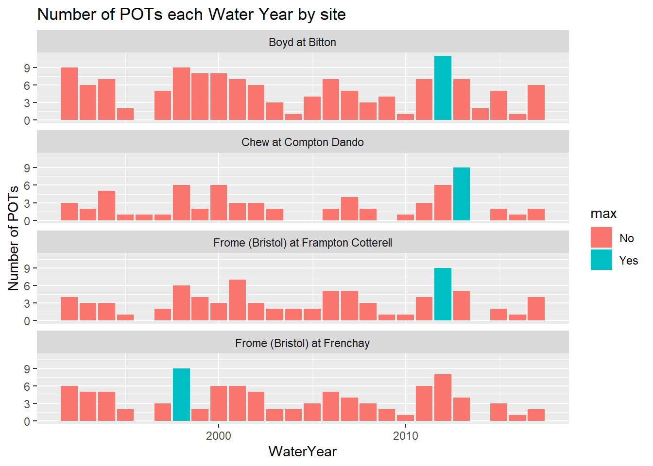
An interesting visualisation! Maybe not quite what we were expecting, but again it invites further questions about the data. Clearly only two sites (Boyd at Bitton and Frome at Frenchay) had most POTs in the same year - the 2012 Water Year. There was also lots of POTs in 1998, the most for Frome at Frenchay and second or third most for the other three sites.
This data is of course very rich - there’s more we could look at. Such as:
- individual dates
- time of year
- follow water flow down a river system (as opposed to picking an area)
and much else too! That’s enough for me for today, though.
4 Conclusion
The winfapReader package is very cool, and very powerful when combined with the rnrfa one. I only looked at a specific area, and it was quick to get the data I wanted.
Thank you Dr Ilaria Proscdocimi. I am flattered to be included as a contributor to this work.
Thank you also to my father, who proofread this blog and made all the words nicerer.